


The Daemons
18 April 2012As a change from discussing why I chose certain images and how I arranged them, I thought I'd talk about some of the Photoshop techniques I used in producing my cover for 'The Daemons'. Photoshop is such a fabulously powerful and flexible program that there are myriad ways to achieve the same or similar results, so none of the following is intended to suggest the best or only way to go about things. These are just some of the methods I use which work for me and might, I hope, give some insight into how a composition is achieved.
Click on the images to see larger versions with captions
CUTTING OUTThere are numerous ways to 'cut out' pictures -- that is, to separate one element from those surrounding it (usually a figure from its background). Drawing a path around it or selecting it with various lasso tools are common, but my preferred method is to use layer masks. These are greyscale channels attached to a layer that determine which elements of that layer are visible -- where the mask is black the layer is hidden, where it's white the layer shows through, where it's a shade of grey the layer is proportionately transparent. (You can set a mask to do the reverse, so white obscures and black displays, but to me it makes more sense that black is the mask and white the 'hole'.) By using a mask, you're just hiding areas of the image, not removing them irreversibly. Thus if you make a mistake or change your mind, you can just paint white where you want to restore bits.
To cut out Bok, I added a mask to his layer that was all white (pic 1). I then used a soft brush -- the size will depend on the size and sharpness of the image you're cutting out -- to paint black around the outline of the figure. The advantage, I find, of using brushes rather than, say, the Pen tool is that I can vary the hardness with which I'm painting depending on the area I'm outlining. For instance, if there's fuzzy hair or a change in depth of focus (such as the Doctor's gun on my 'Talons of Weng-Chiang' cover), I can switch to a softer brush for those bits. I tend to use brushes with 0% hardness as the images I have to work with are often small or low resolution and I find that while giving a figure a crisp outline can give the illusion it's a sharper image than it really is, if the edge is a lot harsher than the details within the cut-out image it just looks odd. Certainly organic figures benefit from a softer edge, whereas something like a Dalek I might use a 50% hardness brush or, if I want to be sure of a straight line, draw a path around it then select with a 1- or 2-pixel feather.
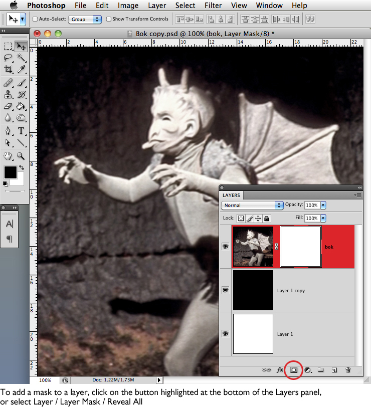
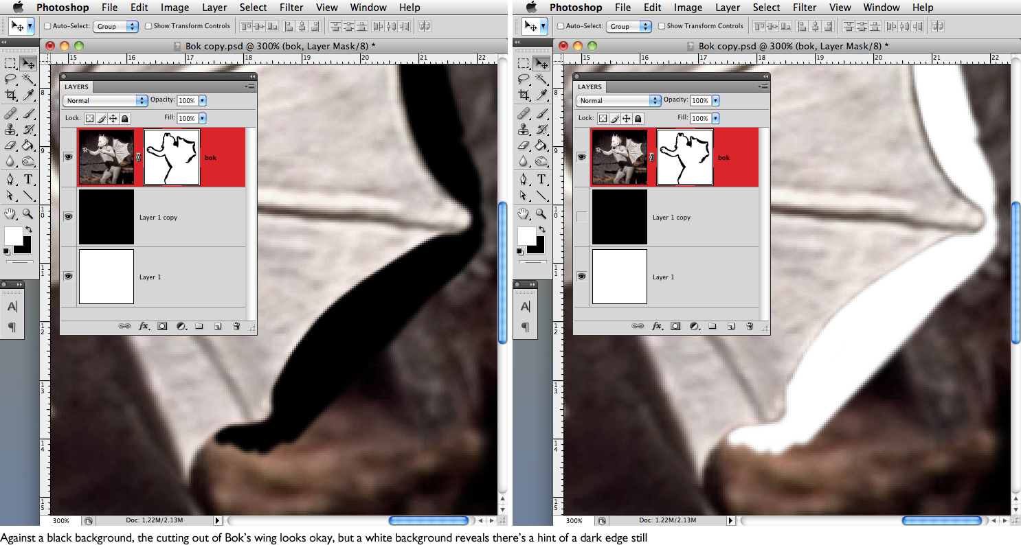
To make sure I'm getting a clean edge while painting, I create two layers below my main image, one solid white and one solid black. Where the image is pale against a dark background, I'll set the white layer to show through so I can see if any halo of darkness persists, and paint closer to the figure's edge if so (pic 2); conversely, if the figure is dark against a pale background, having the black layer show through shows up any light halo remaining. As I go along, if I paint out too much, I can switch to a white brush and reinstate the image. Once I've been all round the figure I fill in the outside of the outline with black using the Paint Bucket tool, then check it again against white and black backgrounds and remove any remaining dark or light edges. The figure can then be dragged onto my illustrations and sized and positioned as necessary. And because the full image is still there, just masked out (pic 3), if I then want to tweak the outline once the figure's against its new background, I can easily adjust the mask some more by painting with black or white as appropriate.

Again, I'm sure there are several ways to add colour to a black and white image but this is the method that I use. It's kind of similar to how the Restoration Team restore the colour to certain Pertwee episodes by using the detail from the greyscale image to add form to the less structured colour image. The way I apply this is to overlay colour layers with the mono image's mode set to Luminosity -- that is, the colour will take its lightness and darkness from the mono image above. An alternative is to add layers of colour above the mono layer, with their mode set to Color -- the result is the same (pic 4).
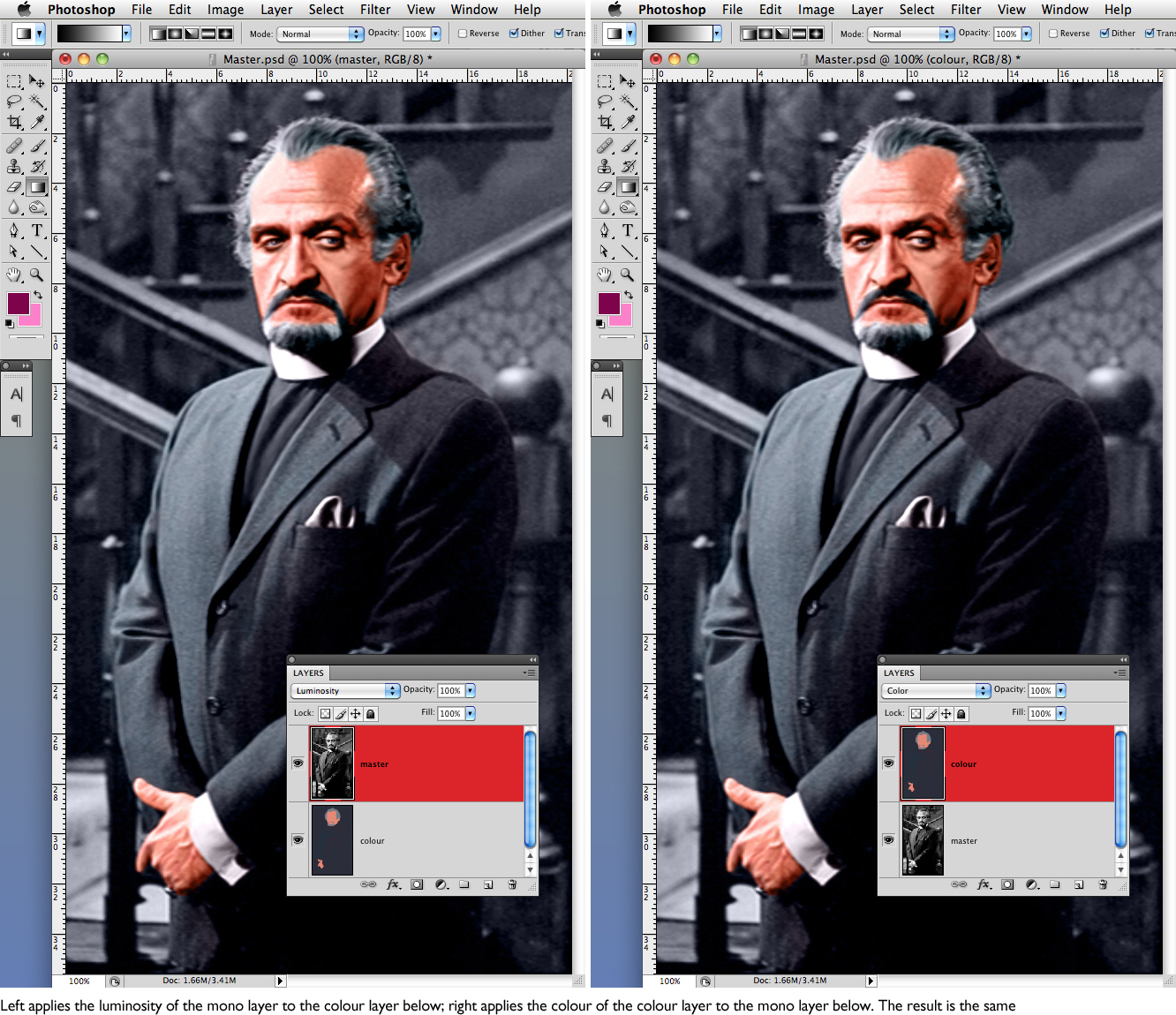

Colouring in the Master was fairly straightforward as he's wearing a simple dark jacket. So with my mono layer set to Luminosity, I added a layer below filled with a bluish-grey (even with areas that are intended to be grey or dark, it's better to add some colour otherwise it'll look like you've forgotten to colourise part of the image). Onto this I painted a slightly bluer shade where the jacket was lighter, and a slightly more purple one where the jacket was in shadow. The differences barely show when you look at the colour layer alone, but do make a difference when the lightness values from the mono layer are added. I then added further layers, one for his skin tones on face and hand, and another for his hair. Working with multiple layers for different coloured areas allows you to adjust each individually and blend them at joins using layer masks, the Smudge tool or just erasing bits with the Eraser tool set to a low percentage. Pic 5 shows just the colour layers for the Master's head. It's hard to see all the variation but there's a slightly pinker tone on his nose, lips and cheeks, a touch greyer under his eyes, and some purplish highlights on his hair where the light will strike it. But you don't have to try to paint in all the details of his face as these will come from the mono layer.
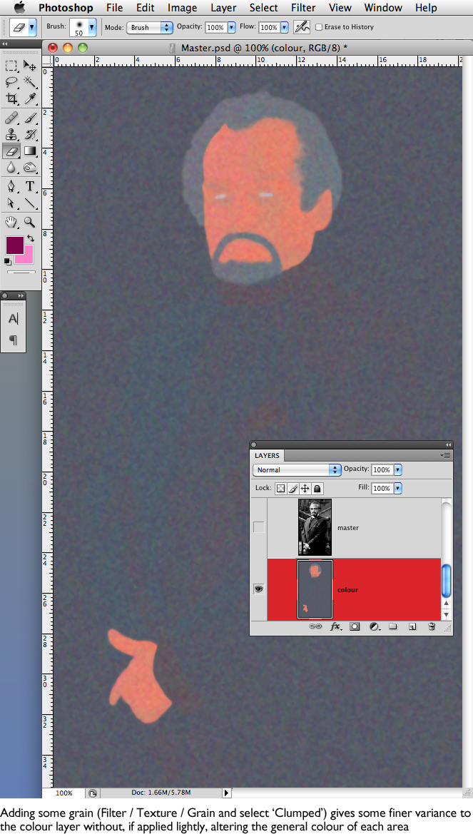 Once I'm reasonably happy with the colours, I'll merge those layers (not the mono one) and, to introduce an element of randomness, apply a Clumped Grain Texture filter that helps break up the flatness of the colour (pic 6). I'll then merge the colour and mono layers and do further brightness, contrast, colour, shadow and highlights adjustments, as I would if it were a colour photo, to get the overall tone balanced nicely.
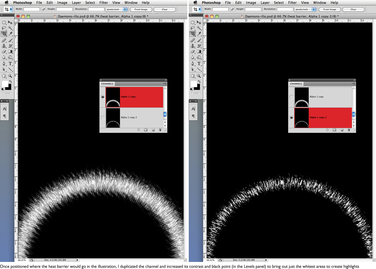
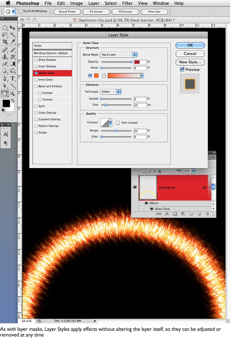
 Often with effects like these I might have a vague idea of how to achieve it, but it'll take a bit of trial and error to get it right. With this it worked pretty much first time, so I was rather pleased. I began with a large greyscale square canvas that I filled with with a Fibres render (which I haven't used before but fills an areas with randomised streaks), playing around with the settings to get what felt the right density. I used the Polar Coordinates filter to convert these to radiating streaks, then masked out a centre circle and the outside of a larger circle to get a ring of strands (pic 7). To break up the edge of the ring I applied the Ripple filter, then a Gaussian blur to soften the edges. I then flattened the image and pasted it into a new channel in my cover document. I sized and positioned this to where I'd want the heat barrier to be, then used it to make a selection on a new layer of the illustration which I filled with a fiery orangey-yellow. To get some white highlights, I duplicated the channel, increased the contrast and adjusted the levels so there were fewer white areas, then used this to make a new selection and fill it with white (pic 8). Finally I added a deep orange outer glow to give it more 'heat' (pic 9).